Enterprise Manager dashboards are data visualization tools that gather real-time data from the enterprise and display them in easy-to-interpret widgets. Dashboards enable you to monitor your IT infrastructure or specific areas or targets at a glance, and quickly identify outliers and take corrective action.
Enterprise Manager comes with a set of pre-built dashboards. You can duplicate any of them and customize your copy, or create new custom dashboards tailored to your specific requirements.
Licensing
The dashboard framework is part of the base features of Enterprise Manager. However, some of the management repository views that you may want to use in your own queries may be licensed under a management pack. Refer to the Enterprise Manager Licensing Information User Manual for more details.
Privileges
Enterprise Manager repository owner (SYSMAN) and super administrators have all required privileges by default. For privileges needed by regular administrators please refer to “Using Dashboards” in the Reference section below.
Work with Dashboards
Enterprise Manager (13.5 and 24ai) comes with a set of pre-built dashboards. New dashboards may be added with new release updates (RUs). In OEM console, navigate to “Enterprise” -> “Dashboards” to see the dashboards available in your version of Enterprise Manager. Click on “Show Widgets” and “Show Filters” to see what’s available out-of-box.
OEM Dashboards consist primarily of widgets and filters. You can add widget groups and tabs to organize your dashboard. Click on the 3-dot menu of any of the existing dashboards to see the actions available. You can clone any of the out-of-box dashboards and customize your copy. You can also export custom dashboards and import them in another Enterprise Manager system. This is helpful if you have Prod and Non-Prod Enterprise Manager systems.
In the remainder of this blog, I will walk you through creating a custom dashboard using some of the out-of-the-box widgets and your own query-based widgets.
Use Case 1: Out-Of-Box Widgets
Some of the widgets I demo make use of OEM groups. Before you start, create host and database groups, using static or dynamic for group type. Ensure the groups contain member targets. For this demo I created “Host Group” and “Database Group”.
On the Dashboards screen in OEM console, click “Create Dashboard”. On the “About” tab on the right, give your dashboard a name and a description, then click on the “Widgets” tab. Many of the widgets here are used in the out-of-box dashboards.
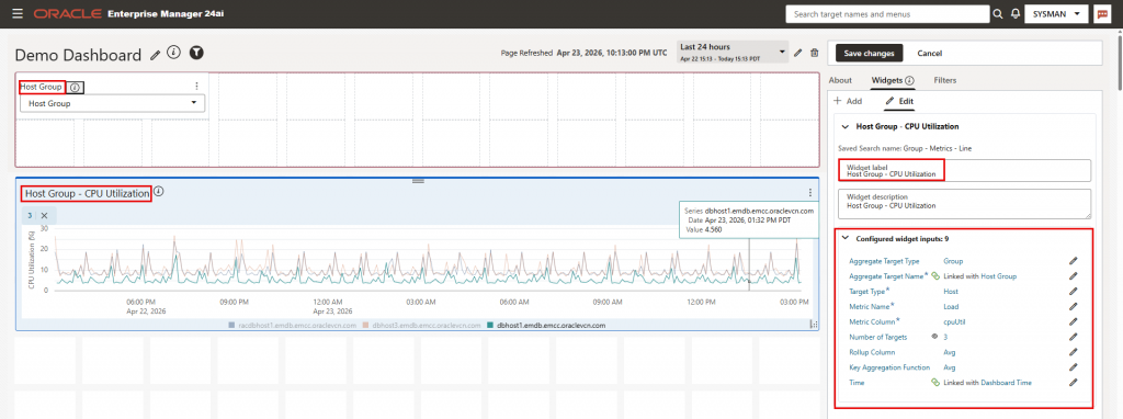
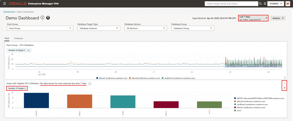
In the search box, enter “Group – metrics – line” and drag the widget to the canvas. The widget automatically adds a filter named “Aggregate Target Name”. In the “Configure Target Type input …” pop-up window, choose the first option (Link the “Target Type” input of the widget to this filter). Click “Save Changes”, then cancel the next pop-up window that asks to configure the metric name.
Click the 3-dot menu on the Filter “Aggregate Target Name”, then “Edit”, and change the filter label to “Host Group”. Next, click on the 3-dot menu for the widget, and change the widget label to “Host Group – CPU Utilization”, and configure the following inputs on the right of the page:
- Target Type: Select “Specify the Target Type input” and select “Host”
- Metric Name: Load
- Metric Column: CPU Utilization (%)
- Number of targets: Default is 3. You can increase this number, but the more you increase it, the more data points the dashboard will retrieve and you may encounter performance issues. A better option is to check the checkbox “Is editable by viewers”
- Keep the Rollup Column and key Aggregation Function at default
- Time: Change from the default of “Last 7 days” to “Link with dashboard time”
We will now add a widget group:
- In the right hand side panel, on the Widgets tab, click “Add”-> “Add widget group”. A widget group is added to the canvas.
- Click on the 3-dot menu and change the name from “Untitled” to “Host”.
- Now click on the 3-dot menu of the Host CPU Utilization widget we just created, and click on “group”. Add it to the “Host” group.
- Expand both the widget group and the widget to fill the width of the page
Next, we’ll add a “Database” tab to the widget group and 2 database-related out-of-box widgets:
- Click on the 3-dot menu of the widget group and select “Add Tab”
- Click on the “+” sign that now shows next to the 3-dot menu of the widget group. A new tab is added. Change its default name to “Database”.
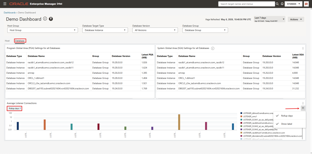
Next, we’ll add 2 more widgets. On the Widgets tab, enter “Global” in the search box. The list will show the following widgets
- Program Global Area (PGA) Settings for all Databases
- System Global Area (SGA) Settings for all Databases
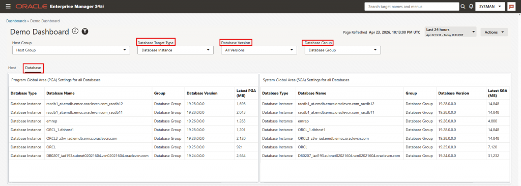
Drag the first widget to the canvas area of the dashboard. Three filters are added automatically: “Database Target Type”, “DB Version Filter”, and “Groups”. Notice the information pop-up boxes informing you that the filters were configured successfully for your widget. Next, add the second widget above, adjusting the size of both widgets on the canvas as desired. Change the label for the filters and widgets as follows:
- Filter “DB Version Filter”: “Database Version”
- Filter ” “Groups”: “Database Group”
- Widget “Program Global Area (PGA) Settings for all Databases”: “Database Group – PGA Settings”
- Widget “:”System Global Area (SGA) Settings for all Databases”: “Database Group – SGA Settings”
Click on the 3-dot menu of each the two widgets and click Edit. You will see that the 3 input parameters for the widget were linked to the 3 filters in the top section of the dashboard. Save the dashboard.
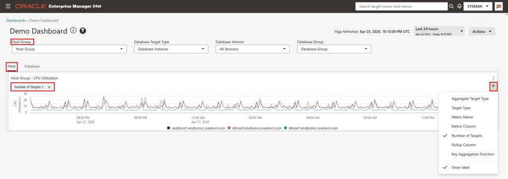
Note the following for the Host CPU Utilization widget:
- As you increase the dashboard time window in the time selector, the resolution of the graph lines changes since metrics are stored in the repository at different resolutions based on the age of the metrics.
- To allow users to select the number of targets to show in the widget, click on the 3-dot menu of the widget then “Open widget control panel”. Click on the “+” sign and select “Number of Targets” and “Show Label” from the drop-down list.
Use Case 2: Query-Based Widget with Pre-Defined SQL
On the “Host” tab we added an out-of-box widget to show CPU Utilization for hosts in an OEM group. In this section, we will add a “Query-Based Widget with Pre-Defined SQL” to show top N hosts with highest CPU utilization, where N is configurable by the dashboard user. This widget will look at all host targets in OEM, not those in a specific group.
Edit the dashboard just saved by clicking “Action”->”Edit”. Click on the “Widgets” tab in the right hand side panel, then click the “+” sign under the “Add”, then “Create query-based widget”.
On the next screen, keep “Data Source” as “EM Repository”, and click on the “SQL Selector” drop-down list. The list shows a number of pre-defined SQLs available to use as-is, or to convert to custom SQL. We will use one of the pre-defined SQLs. Choose “Enterprise – rollup metric time series” under “Pre-defined SQLs”. This query is meant for showing aggregated data over a long period of time. It won’t return data for time intervals less than 7 days.
The SQL query is displayed in the main panel. The right hand side panel will open to the widget settings tab. Set the widget inputs in this panel as follows:
- Target Type: Host
- Metric Name: Load
- Metric Column: CPU Utilization (%)
- Number of rows:
- Click on the “Number of Rows” link and change the input label to “Number of Targets”
- Click on the default value of 25. In the pop-up window, change the value to 5, both under “Default Settings” and “Configure widget input”. Under “Default Settings”, checkbox “Allow widget users to specify the Number Of Rows input” is checked by default. Keep it checked.
- Time: Link with Dashboard Time.
Click on the “Visualization” tab:
- Chart Type: Bar Chart (default)
- Y axis: Value (default)
- X axis: TARGET_NAME
- Series: Leave blank (default)
- Color by: TARGET_NAME. This will use different colors for different targets.
- X axis title: Host name
- Y axis titel: CPU Utilization (%)
- Legend: Right
- Stacked: Yes
Click on the “About” tab:
- Name: “Hosts with Highest CPU Utilization”
- Description: “Hosts with Highest CPU Utilization. No data shown for time intervals less than 7 days”
Click “Save”. The widget is currently on the dashboard main canvas and would be visible whether you are on the Host or Database tabs. Click on the widget 3-dot menu. Click “group” and move it the Host tab. Expand the widget width to fill the screen width.
Next, click on the widget 3-dot menu and click Edit. Use the description from above for widget label. Save the dashboard, then click on the 3-dot menu of the widget and click “Open widget control panel”. Click on the “+” sign now showing under the 3-dot menu and select “Number of targets” and “Show label”.
Use Case 3: Query-Based Widget with Custom SQL
In this section I will demonstrate creating a new query-based widget. I will use a query from chapter 20 Examples of the Enterprise Manager Management Repository Views Reference document, namely, “How do I obtain the average number of connections for a listener for a specific period?“. To better understand the query, review the description of MGMT$METRIC_DAILY view in the same document, and in particular, column ROLLUP_TIMESTAMP in the view.
I will modify the query slightly: I am excluding my ASM listeners for the purpose of this demo, and I am making “Rollup days” a variable the dashboard user can modify:
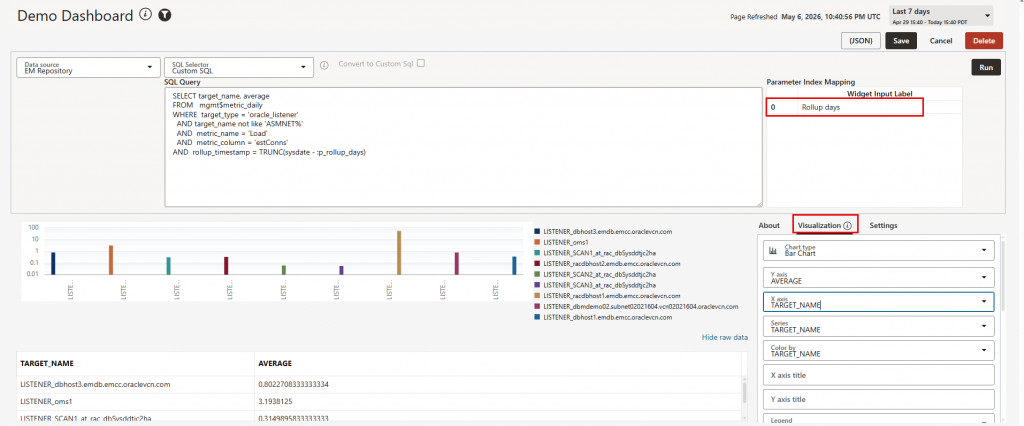
SELECT target_name, average
FROM   mgmt$metric_daily
WHERE  target_type = 'oracle_listener'
  AND target_name not like 'ASMNET%'
  AND  metric_name = 'Load'
  AND  metric_column = 'estConns'
AND  rollup_timestamp = TRUNC(sysdate - :p_rollup_days)
Edit your dashboard and click on the “Widgets” tab in the right hand side panel, then click the “+” sign under the “Add”, then “Create query-based widget”.
On the next screen, keep “Data Source” as “EM Repository”. The “SQL Selector” drop-down list shows a sample “starter” query. The documentation here provides instructions how to customize it. For our purpose, replace the entire query with the code block above. Configure the widget as follows:
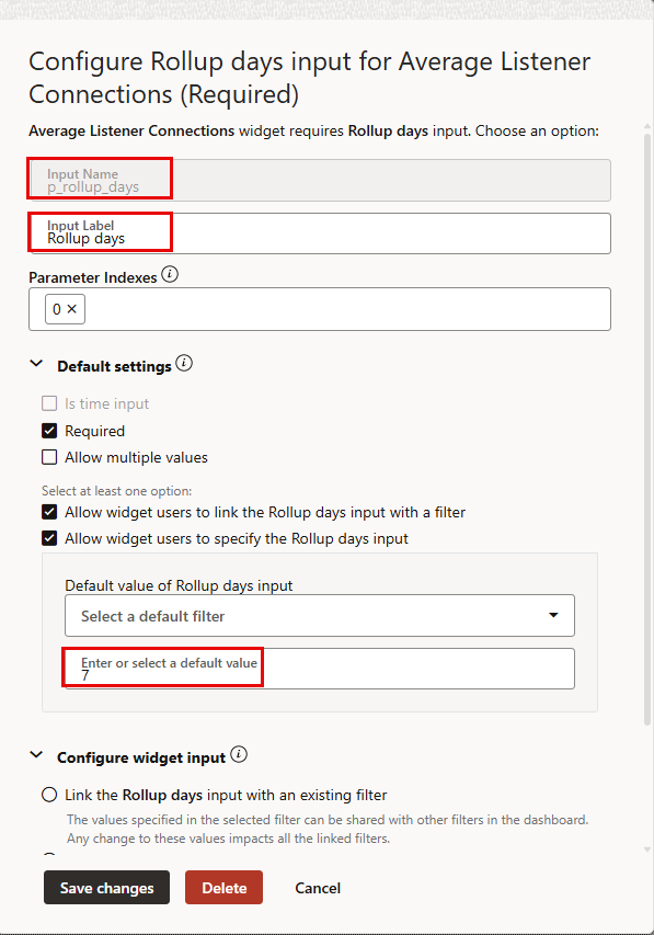
- Click on the “Settings” tab on the right hand side, and click the “+” sign next to “Add widget input”
- Input Name: p_rollup_days
- Input Label: Rollup days
- Expend Default settings and use 7 for default value
- Leave everything else at default
- Click on the Visualization tab:
- Char type: Bar Chart (default)
- Y axis: Average (default)
- X axis: TARGET_NAME
- Series: TARGET_NAME
- Color by: TARGET_NAME
- Legend: Right
- Scroll down and change “Y axis scale” from Linear to Log (for better visualization when there’s a large difference between the most and least active listeners)
- Click on the About tab
- Name: Average Listener Connections
- Description: Average number of connections for a listener in a specific period
- Click Save to save the widget
- Click on the 3-dot menu of the widget, then click “Group” and add it to the “Database” tab of the dashbaord
- Click “Save changes” to save the dashboard
Click the 3-dot menu in the top right corner of the widget, and click “Open widget control panel”. Click the “+” sign and check both “Rollup days” and “Show label”