Introduction
You’ve read How to Query the CPQ Metrics API and you’d like to download your CPQ business metrics but you’re more interested creating visualizations based on all the items instead of filtering certain values. “Let’s download everything and then we’ll decide what we want to do with it”, is more your mindset.
This post will help you get started down that road using Python to download all metrics and pandas dataframes to create graphs and visualize data, thanks to its lightweight syntax and matplotlib functions.
Getting Started
You can best follow along with this example code in a Jupyter Notebook. Of course, you also need a working Python environment including pandas. There are several options for setting up your environment, but we’ll start with pip.
Install the libraries used in this post with pip install pandas matplotlib. Also install Jupyter Notebook with pip install jupyterlab.
Read Metrics into Dataframe
The new Metrics REST API is a collection resource which represents a list of items – in this case business metrics. You can filter, sort, paginate, and expand your collection resources to make large result sets easier to use and consume. Our example code will retrieve all available metrics so we will need to use the collection pagination parameters, in particular limit, offset and hasMore, to ensure we retrieve all available items.
import requests
from requests.auth import HTTPBasicAuth
import pandas as pd
import time

def get_metrics(**kwargs):
    """ Get CPQ Business Metrics
    Retrieve all business metrics within the Oracle CPQ application, including API, Login, Quoting, and Quoting Performance metrics.
    Note: The Metrics REST API is only available for FullAccess users with administrative permissions and access to the Commerce Settings and/or General Site Settings.
    See https://docs.oracle.com/en/cloud/saas/configure-price-quote/cxcpq/op-rest-v18-metrics-get.html

    Keyword Arguments:
    host: str
        CPQ host name
    version : str, default 'v18'
        CPQ REST API version
    username: str, default 'superuser'
        CPQ user name
    pwd: str
        CPQ user password
    """

    def exec_request():
        try:
            print(f'GET {url}, {params}')
            with session.get(url, params=params) as response:
                return response.json()
        except Exception as e:
            print(e)

    # Get passed variables
    host = kwargs.get('host')
    version = kwargs.get('version','v18')
    username = kwargs.get('username', 'superuser')
    password = kwargs.get('password')

    # Initialize variables
    result = []
    has_more = True
    offset = 0
    params = {'offset': offset}

    # Create session object
    session = requests.Session()
    # Set authorization
    session.auth = HTTPBasicAuth(username, password)
    # Set url for business metrics request
    url = f'https://{host}/rest/{version}/metrics'

    while has_more:
        # Make request
        data = exec_request()

        # Add items to result
        result.extend(data['items'])

        # Check hasMore value
        has_more = data['hasMore']

        # Get new offset, increment current offset by limit
        limit = int(data['limit'])
        offset = offset + limit
        params['offset'] = offset

    return result

start_time = time.time()

# Get all CPQ business metrics
metrics = get_metrics(
    host = 'cpq-example.oracle.com,
    username = 'superuser',
    password = '123456')

# Load list of dict to pandas dataframe
df = pd.DataFrame(metrics)

# Convert `value` column to float
df['value'] = pd.to_numeric(df['value'], errors='coerce')

# Convert multiple columns to datetime
cols = ['startTime', 'endTime', 'dateModified', 'dateAdded']
df[cols] = df[cols].apply(pd.to_datetime, errors='coerce')

# Set datetime index based on date metric was added
df.index = df['dateAdded']

# Remove unused columns
df = df.drop(['metricsId', 'dateAdded'], axis=1)

df.info()

end_time = time.time()
print(f'Execution time: {end_time-start_time:.6f}')
As you can see above, we use the pandas.DataFrame() method to load our list of dicts to the dataframe. We also update the dataframe index based on the dateAdded column, marking the date thet metric was added.
Visualization Examples
There are a number of ways that you can plot the different business metrics provided by the Metrics REST API. First, let’s focus on a way to show all metrics at once.
Plot All Metrics
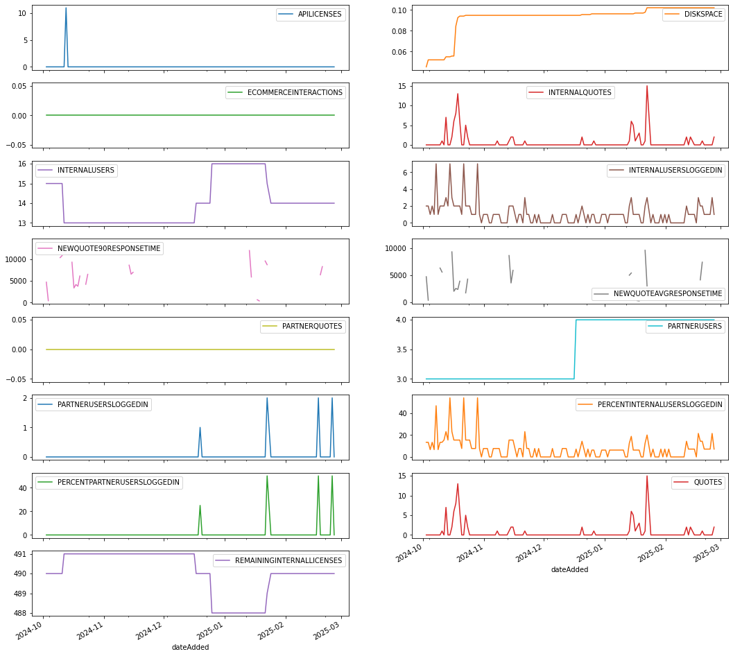
Here’s an example that uses a pivot table to reshape the data by transforming rows into columns. We’re converting the metric name row values into column headers, giving us a broader view of the data which we can use to plot each metric separately using the subplots=True setting.
pd.pivot_table(
    df.reset_index(),
    index='dateAdded',
    columns='name',
    values='value'
).plot(
    subplots=True,
    layout=(8,2),
    figsize=(18, 18)
)
which creates this plot…
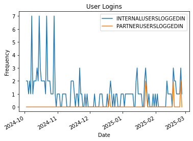
Plot Like Metrics Together
Remember that there are a few groupings of metrics including API, Login, Quote, and Quote Performance metrics.Some of these metrics are describing very different behaviors and don’t necessarily belong together in a chart. That said, some groupings of metrics make a lot of sense together. Those groupings include:
| Metric Grouping | Metric Name | Description |
|---|---|---|
|
Number of Users
|
INTERNALUSERS, PARTNERUSERS | Total numbers of active internal and partner users |
|
User Logins
|
INTERNALUSERSLOGGEDIN, PARTNERUSERSLOGGEDIN | Total number of unique internal and partner users that have logged in |
|
Quotes
|
QUOTES, INTERNALQUOTES, PARTNERQUOTES |
Total number of new quotes that were both created and saved at least once |
| Quote Performance | NEWQUOTEAVGRESPONSETIME, NEWQUOTE90RESPONSETIME | Average and 90th percentile response time (ms) it took to create a new quote |
Below is a simple example that filters the metrics returned to only the number internal and partner users and creates a line plot by date.
logins_metric_list = ['INTERNALUSERSLOGGEDIN', 'PARTNERUSERSLOGGEDIN']
df.query('name in @logins_metric_list').groupby('name')['value'].plot(
    legend='True',
    ylabel="Frequency",
    xlabel='Date',
    title='User Logins')
which creates this plot…
Resample and Plot
Remember that we converted the dateAdded column to our index in the dataframe. When we filter our set down to a single metric, such as ‘QUOTES’, that means we are working with a time series. Pandas has a convenience function for frequency conversion and resampling of time series data, namely the resample function.
Using resample we can convert our daily QUOTES metrics to a monthly frequency – or any other frequency you like, see the offset frequencies for more info.
import numpy as np
import matplotlib.dates as mdates

monthly_quotes = df.loc[df['name'] == 'QUOTES'].resample('MS').sum()
ax = monthly_quotes.plot(figsize=(10,5), kind='line', x_compat=True, xlabel='Month', title='New Quotes by Month')

# Set major and minor date tick locators
maj_loc = mdates.MonthLocator(bymonth=np.arange(1,12,2))
ax.xaxis.set_major_locator(maj_loc)
min_loc = mdates.MonthLocator()
ax.xaxis.set_minor_locator(min_loc)

# Set major date tick formatter
zfmts = ['', '%b\n%Y', '%b', '%b-%d', '%H:%M', '%H:%M']
maj_fmt = mdates.ConciseDateFormatter(maj_loc, zero_formats=zfmts, show_offset=False)
ax.xaxis.set_major_formatter(maj_fmt)

ax.figure.autofmt_xdate(rotation=0, ha='center')
ax.set_xlim(monthly_quotes.index.min(), monthly_quotes.index.max());
We also customize the time series tick labels using tick locators and formatters from the matplotlib.dates module (mdates), which creates this plot…
Summary
Hopefully you now have everything you need to create visualizations of your CPQ business metrics using pandas dataframes and matplotlib to plot and visualize data. Get started with these examples in your next project. Happy hunting!
~sn